
Taiwan Space Agency Website
An Immersive Website Experience Brings TASA's Missions to Life
The Taiwan Space Agency (TASA) is focused on advancing space technology and research to support Taiwan's national interests and contribute to the global space community. However, the old website design was outdated, lacked interactive elements and responsive design, resulting in a text-heavy layout that failed to effectively communicate TASA's missions and services to the public.
To address this, I aimed to improve information delivery in a clear and engaging manner by enhancing the information architecture and navigation, and incorporating interactive elements to balance the text and create a more immersive user experience.
My Role

Collaborating as one of two product designers, I developed a scalable design system with interactive elements and restructured the information architecture and navigation. This revamp aimed to create a more immersive user experience, making it engaging and enjoyable for the public to learn about the importance of Taiwan's space mission.
Project Scope

-
2 Product Designer, 1 Product Manager,
2 Engineer -
4 Months (Oct 2023 - Feb 2024)
Solutions Quick Peek
TASA's space mission is brought to life through a minimalist, interactive website. The playful design combined with enhanced navigation and information architecture ensures space enthusiasts can easily explore and understand TASA's missions and services.

Streamlined Homepage Motivates Solution Exploration

The redesigned homepage, with its intuitive navigation, empowers users to discover the most relevant solutions and access up-to-date information, simplifying their journey to finding the perfect fit.
Clear Solution Page Improves Decision-Making
The new solution page features a well-organised layout and effective CTAs, making it easier for users to grasp key details and make efficient purchases.
53K+
new registrations to date
3K+
new account holders under 20
56%
growth in user engagement rate for the new homepage.
Design Process
(Coming Soon...)
Process (Coming Soon)
First of all, 3 Senior Product Designer and 2 Product Managers were conducted the Heuristic Evaluation for the previous website to understand the problems. We identified several issues, especially the designs of the homepage and solution detail page, which are the main factors affecting solution discovery and purchases.
Main Issues Were Identified:
-
The static homepage structured differently from participants’ expectations; they thought it would focus more on solution exploration.
-
The solution detail information was cluttered, making it difficult to understand key features and benefits, causing user frustration.
-
The information was not up-to-date, leading to a low engagement and poor SEO performance.
-
Some UI elements were unclear and difficult to understand.

First of all, 3 Senior Product Designer and 2 Product Managers were conducted the Heuristic Evaluation for the previous website to understand the problems. We identified several issues, especially the designs of the homepage and solution detail page, which are the main factors affecting solution discovery and purchases.
Website Heuristic Evaluation
Homepage’s Issues to Address

Solution Detail Page’s Issues to Address

Main Issues Were Identified:
-
The static homepage structured differently from participants’ expectations; they thought it would focus more on solution exploration.
-
The solution detail information was cluttered, making it difficult to understand key features and benefits, causing user frustration.
-
The information was not up-to-date, leading to a low engagement
-
Some UI elements were unclear and difficult to understand.
Streamline Homepage’s Navigation to Solutions
Enhance navigation to help users find suitable solutions and useful solution information efficiently.
Simplify Solution Details Presentation
Organise and present solution details clearly to ensure users can easily understand key features and benefits, reducing frustration.
Incorporate Timely Helpful Content
Provide up-to-date, valuable content to make it easier for users, especially new users, to identify the best solutions for their needs.
Clarify UI Elements
Improve the clarity and intuitiveness of UI elements to ensure they are easy to understand and interact with, enhancing overall user experience.
Design Goal
To address the identified issues, I thoughtfully defined the design goals:
According to the Heuristic Evaluation, I identified a need to reorganise the information architecture of the platform. Therefore, the Product Manager and I collaborated on revamping the categorisation and classification of information, grouping it based on primary user scenarios.
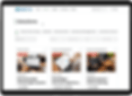
For example, to prioritise solution discovery on the homepage, I added "Latest Solutions" and "Solutions for Every Stage" sections to help users efficiently find the solutions they need. I also suggested to incorporate timely support resources like "Latest News" and "User Story Videos" from their YouTube channel to keep users up-to-date with insights and trends, helping them make informed decisions. Additionally, I removed the low-priority "Subsidy Application Instruction" information, as it is already available on the Subsidy page.
Information Architecture Restructuring

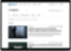
In addition to the significant changes to the homepage structure, I also suggested adding an "Insights" page featuring successful user stories. This will help new customers identify suitable solutions based on others' experiences and improve SEO performance.


At this stage, my team and I conducted focus group among 6 SMEs from different industry to test usability and learn more about user needs. As the host of the focus group session, I had a valuable opportunity to share our designs with the target users and engage with them directly.
First Version for User Testing

We gained helpful feedback after the focus group and then iterated design based on it. Here are some important design improvements:
Design Iterations
Homepage First Version

Redesigned Homepage Based on User’s Feedback

Solution Details Page First Version

Redesigned Solution Details Page Based on User’s Feedback

I revamped homepage navigation, prioritising solution discovery. Additionally, I implemented a rounded corner design that aligns the new illustrations and icons, creating a more visually engaging and vibrant homepage experience.
I applied a familiar e-commerce layout to the redesigned solution details page and used a one-page design instead of tabs. This approach simplifies exploration and fosters intuitive interaction, allowing users to grasp key solution details more quickly.
Article First & Redesigned Versions

I implemented a two-column layout for faster content access. This streamlines information hierarchy, making key details and articles readily available on any screen size.
Our Services
Final Design
Streamline Homepage’s Solution Exploration
The new homepage features easy navigation to solutions by category, latest solutions, and solutions for every stage, helping users quickly find the solutions they need. Additionally, timely useful information such as news and user story videos help users make informed decisions based on current trends and developments. These features have improved user engagement rates by 56%.

Simplify Solution Details
The new solution page presents information in a clear and structured manner, guiding users' attention to key details and improving decision-making efficiency.
Incorporate Timely Helpful Content
The new Insight page provides articles about real-life situations helps users relate to the content and see how cloud solutions can apply to their own needs, increasing user engagement.


Clarify UI Elements
This new, and consistent design system ensures that users encounter familiar components across different pages, reducing the learning curve and making navigation more intuitive.

Since its launch in November 2023, the FRS App has shown some remarkable achievements, such as 39% increase in mobile platform adoption and 100,000+ total app users to date. I have been actively involved in the app's ongoing optimisation, and my next focus is designing the highly-requested "buying at low prices process" based on valuable customer feedback.
Next Step
Key Takeaways
As the lead designer of this project, I supervised a junior designer, ensuring that the design quality met the standards and deadlines. Supporting designers with less experience not only enhanced my leadership capabilities but also helped me gain new perspectives and challenge my own thinking.
01
Helping others helps me grow too
In this project, I had the opportunity to work with an excellent third-party UX consultancy that provided initial wireframes. Building upon these initial wireframes, I actively proposed improvements to enhance the overall user experience. However, we occasionally faced disagreements, especially concerning user experience optimisation. In that case, I presented the results of user testing with a low-fidelity prototype, using evidence from both perspectives to persuade them to accept my suggestions. This approach showed my ability to clearly articulate issues and building consensus even when people disagreed.
01
Don’t be afraid to challenge the status quo


