TCloud Marketplace
Effortless Cloud Shopping and Up-to-Date Resources for Businesses
My Role

As the solo product designer for this project, I was responsible for redesigning the overall user flows for both the front-end pages and the back-end content management system. I created high-fidelity prototypes and conducted usability testing to ensure a user-centred design approach. (Only the front-end pages will be shown in this case study.)
Project Scope

-
1 Product Designer, 1 Product Manager, 2 Engineers
-
4 Months (Jan - Apri 2023)
Backstory
TCloud Marketplace is Taiwan’s leading B2B SaaS platform, offering cloud solutions designed to help small and medium-sized enterprises (SMEs) grow. The platform aims to make it easy for SMEs to subscribe to the right solutions for their business needs.
The Situation
Although the original site had a strong product offering and above-average conversion rates, the data showed that overall engagement was low. Many users felt lost while navigating the site and struggled to quickly find the right solutions. That’s why TCloud Marketplace came to us.
How might we make browsing and purchasing more intuitive and seamless to boost engagement and drive higher conversions?
Solutions Quick Peek
The redesigned platform features intuitive navigation and a clear information structure, enabling SME users to easily find the solutions they need. Moreover, a streamlined purchase flow allows them to complete transactions efficiently, while up-to-date successful user stories strengthen trust in the platform.

36%
conversion rate increase (8% → 11%)
3K+
new account holders under 20
20%
point growth in user engagement
Success Metric
Website Heuristic Evaluation
First of all, 3 Senior Product Designer and 2 Product Managers were conducted the Heuristic Evaluation for the previous website to understand the problems. We identified several issues, especially the designs of the homepage and solution detail page, which are the main factors affecting solution discovery and purchases.

Main Issues Were Identified:
-
The static homepage structured differently from participants’ expectations; they thought it would focus more on solution exploration.
-
The solution detail information was cluttered, making it difficult to understand key features and benefits, causing user frustration.
-
The information was not up-to-date, leading to a low engagement and poor SEO performance.
-
Some UI elements were unclear and difficult to understand.
Review Data to Uncover User Needs
To uncover the real user journey and prioritise design improvements, I asked the client for data to support our initial decisions. The Active Web Page Analysis and Purchase Flow Funnel revealed key insights to guide our next steps.

Main Issues Were Identified:
-
Most pages clustered in the low-engagement and low-traffic area, with only a few pages showing large bubbles (active users).
-
The solution page showed relatively low engagement and even ranked below the login page, suggesting that the navigation is unclear.
-
The purchase steps 0–1 and 3–1 show a high duplicate rate, which points to unclear UI feedback and an overly complex verification process.
Use Heuristic Evaluation to Identify Usability Issues
Based on the data insights, I conducted a heuristic evaluation with one senior product designer and one product manager to better understand the usability issues. We identified several critical problems, especially on the homepage and on purchase steps with the highest repeat rates, such as the solution detail and the verification pages.
Homepage

Solution Detail Page

Verification Page

Main Issues Were Identified:
-
The homepage didn’t meet users’ expectations; we expected it to focus more on solution exploration rather than showing low-priority information.
-
The solution detail pages were cluttered, making it difficult to understand key features and benefits. CTAs were especially unclear and easy to miss.
-
The verification process is becoming a source of user frustration. The main issues seem to be unclear inputs, confusing CTAs, and the absence of crucial reminders on that page.
-
The website does not feature any case studies, making it harder for users to see real examples and build trust.
Streamlined Homepage’ Navigation to Solutions
Guide users to find suitable solutions and useful information efficiently.
Simple Solution Details Presentation
Present details clearly in groups, saving time on searching for key features.
Clear Purchase Process
Simplify inputs, clarify CTAs, and provide clear reminders to reduce errors and ensure a smooth buying experience.
Timely and Useful Content Aid
Provide verifiable examples of how the product solves real-world business problems to build trust.
Design Goal
To address the identified issues, I thoughtfully defined the design goals:
Restructure Information Architecture after Quantitative & Qualitative Research
After the data review and heuristic evaluation, I identified the need to reorganise the information architecture. I then teamed up with the Product Manager to revamp how information is categorised and structured, grouping it based on key user scenarios.
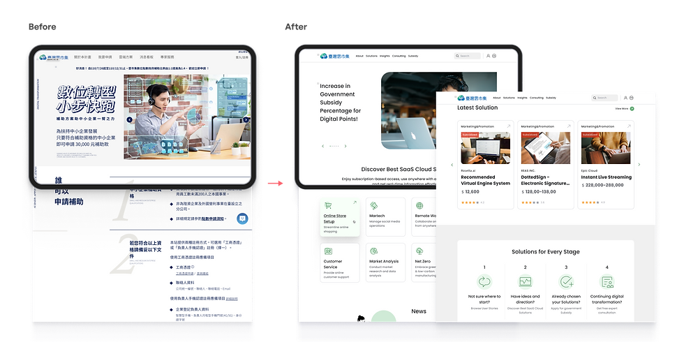
First, we strengthened the homepage navigation for solution discovery by adding “Latest Solutions” and “Solutions for Each Stage” sections to help users find what they need more efficiently. We also moved low-priority information, such as the Solution Provider section and Subsidy Application Instructions, off the homepage while keeping it accessible elsewhere on the site.
Moreover, I proposed adding an “Insights” page featuring successful user stories to provide real-world examples of how the product solves business problems and to build trust with new customers.
Our Services
Final Design
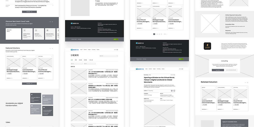
Streamlined Homepage Navigation to Increases Solution Discovery
The new homepage features easy navigation to "Solutions by Category", "Latest Solutions", and "Solutions for Every Stage", helping users quickly find the solutions they need. Additionally, timely news and user story videos help users find solutions that best suit them based on current trends.


Simple Solution Details Improve Decision-Making Efficiency
The new solution page presents information in a clear and structured manner, guiding users' attention to key details and improving decision-making efficiency.
Timely, Useful Content Helps Users Identify Feasible Solutions
The new Insights page features real-life articles that help users connect with the content, see how cloud solutions apply to their needs, and strengthen trust in the platform.

Clarify UI Elements
This new, and consistent design system ensures that users encounter familiar components across different pages, reducing the learning curve and making navigation more intuitive.

Since its launch in November 2023, the FRS App has shown some remarkable achievements, such as 39% increase in mobile platform adoption and 100,000+ total app users to date. I have been actively involved in the app's ongoing optimisation, and my next focus is designing the highly-requested "buying at low prices process" based on valuable customer feedback.
Next Step
Key Takeaways
As the lead designer of this project, I supervised a junior designer, ensuring that the design quality met the standards and deadlines. Supporting designers with less experience not only enhanced my leadership capabilities but also helped me gain new perspectives and challenge my own thinking.
01
Helping others helps me grow too
In this project, I had the opportunity to work with an excellent third-party UX consultancy that provided initial wireframes. Building upon these initial wireframes, I actively proposed improvements to enhance the overall user experience. However, we occasionally faced disagreements, especially concerning user experience optimisation. In that case, I presented the results of user testing with a low-fidelity prototype, using evidence from both perspectives to persuade them to accept my suggestions. This approach showed my ability to clearly articulate issues and building consensus even when people disagreed.
01
Don’t be afraid to challenge the status quo
Streamlined Homepage Motivates Solution Exploration
The redesigned homepage, with its intuitive navigation, empowers users to discover the most relevant solutions and access up-to-date information, simplifying their journey to finding the perfect fit.
Optimising the Purchase Flow to Reduce User Friction
The redesigned flow tackles key user pain points. Here are two pages that used to have the highest repeat rates:
1. The new solution detail page features a well-organised layout and clearer CTAs, enabling users to efficiently grasp key details and make purchase decisions.

2. The updated verification page features more prominent CTAs that guide users to complete this step correctly the first time, along with clear heads-up tips to prevent users from getting stuck, which helps reduce unnecessary repeats.

First Version for User Testing
At this stage, my team and I conducted a focus group with 6 SMEs from different industries to test usability and understand user needs. As the host of the session, I had the valuable opportunity to present our designs to target users, engage directly with them, and gather customer insights. This feedback was crucial in enhancing the overall usability.

Following usability testing, I systematically collected and weighted all identified problems, then prioritised them from most to least critical.


Other Projects
Homepage
In the updated homepage, all the solution categories are now within easy reach, making it quicker for users to choose. For the "Solutions for Every Stage" section, I've used a left-to-right reading pattern, which makes it much easier to follow.
Solution Details Page
The new design replaces the tabs for a single-page scroll format. Also, I’ve moved key info to the right sidebar so users can easily find the important info. Plus, I added anchor links in the review section, making it super easy to jump straight to more reviews.
Article

I implemented a two-column layout for faster content access. This streamlines information hierarchy, making key details and articles readily available on any screen size.
Design Iterations
Wireframes to Clarify Information and Function Needs
At the ideation stage, I designed most pages using the new information architecture, giving us a clear structure for the next detailed design phase.